Scandinavian Interior Design: Colors, Materials, Furniture
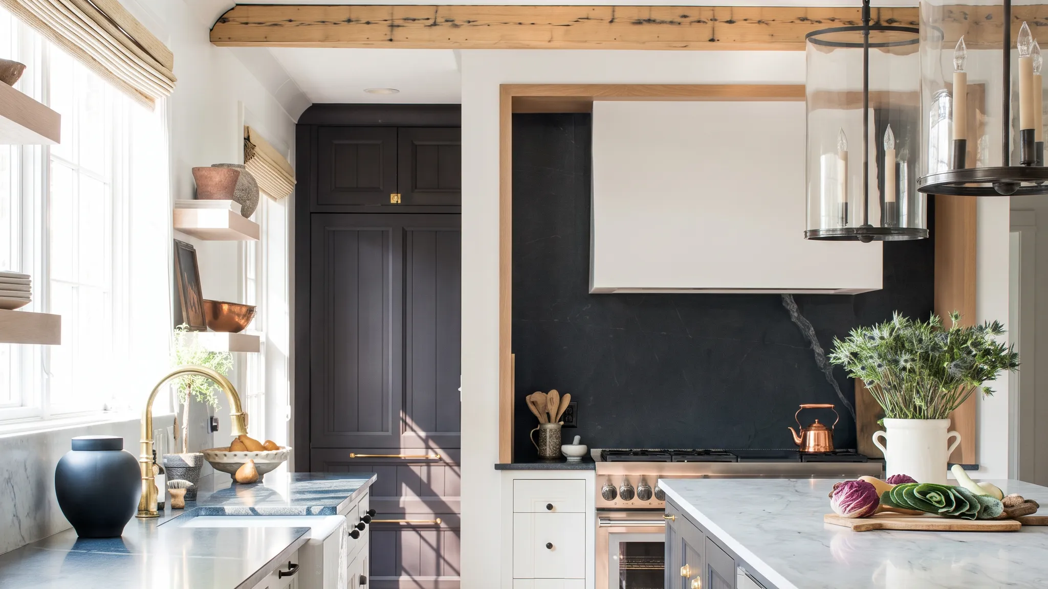
Scandinavian interior design is a warm, functional style built on natural light, pale wood and layered texture. It is not minimalism, and it is not an all-white room. Minimalism strips a space back on principle. Scandinavian design keeps what works, what is comfortable, and what you actually like living with.
Not sure this is your style? Compare it against eleven others in our guide to interior design styles.
Key takeaways
- Warmth is the point. A cold, clinical white room is a copy of the style, not the style itself.
- Furniture sits light. Raised legs, slim profiles, low backs, floor visible underneath.
- Light comes from five to seven separate points in a room, never from one ceiling fixture.
- Texture replaces ornament. Wool, linen and leather do the decorating.
- Restraint, not emptiness. Leave surfaces clear so the room can breathe.
What Scandinavian design actually is
It came out of Nordic functionalism, and two milestones are usually cited: the Stockholm Exhibition of 1930, which launched Swedish functionalism, and the touring exhibition Design in Scandinavia of 1954 to 1957, which introduced the term Scandinavian Modern to North America.
It was reacting against ornate nineteenth century historicism. It borrowed the logic of Bauhaus functionalism, then softened it with natural materials and organic shapes.
The philosophy is democratic and practical: everyday objects, well made, affordable, comfortable to live with. That is why it allows colour, pattern and things you have owned for years, where a stricter modern minimalism would strip them out.
A note on the name. Scandinavia usually means Denmark, Norway and Sweden. Nordic adds Finland and Iceland. In design writing the two terms are used almost interchangeably, and designers disagree on whether there is a real stylistic difference.
How to recognise Scandinavian design
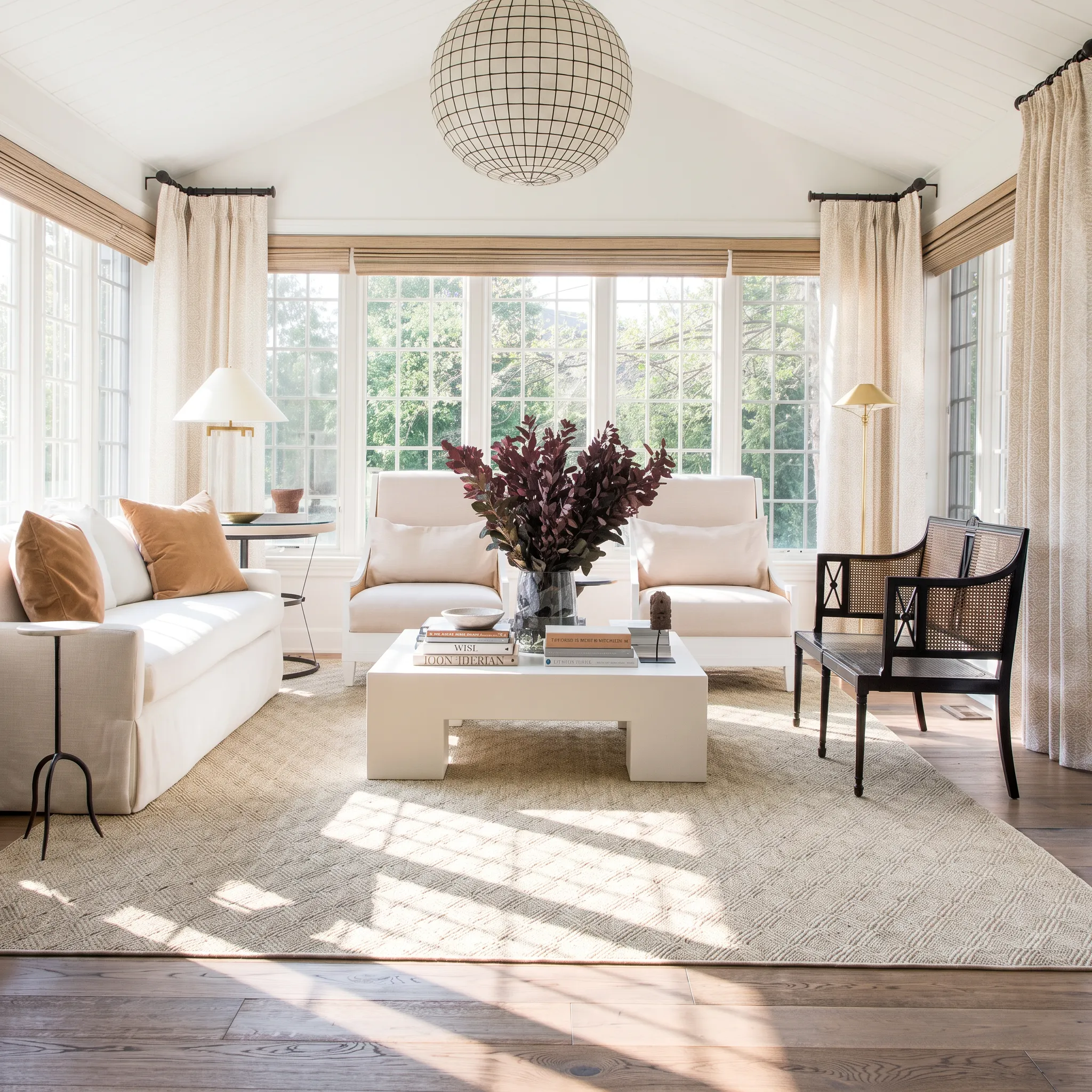
Daylight is treated as a material. Windows are left bare or covered minimally. The reason is climatic, since Nordic winters are dark, but the spatial effect is universal: an uninterrupted window makes the whole wall read as a light source rather than a hole in the plaster.
Wood is used as a colour, not just a surface. Oak, ash, birch and pine in pale tones. Light wood grounds a room and warms it without adding visual weight, which is exactly what a white shell needs.
Furniture sits light on the floor. Raised legs, slim frames, low backs. Seeing the floor run underneath a sofa keeps the floor line unbroken, and an unbroken floor line makes a small room read larger.
Negative space is deliberate. Surfaces stay mostly clear, roughly two thirds of them. Empty space is not wasted space here, it is what lets light travel across the room.
One line repeats. The horizontal of the sofa back, the coffee table and the shelf tend to echo each other rather than compete. Fewer competing lines means a quieter room.
Curves and texture carry the interest. Rounded silhouettes and tactile surfaces replace pattern and ornament. Nothing is decorated, but nothing is flat either.
The Scandinavian colour palette
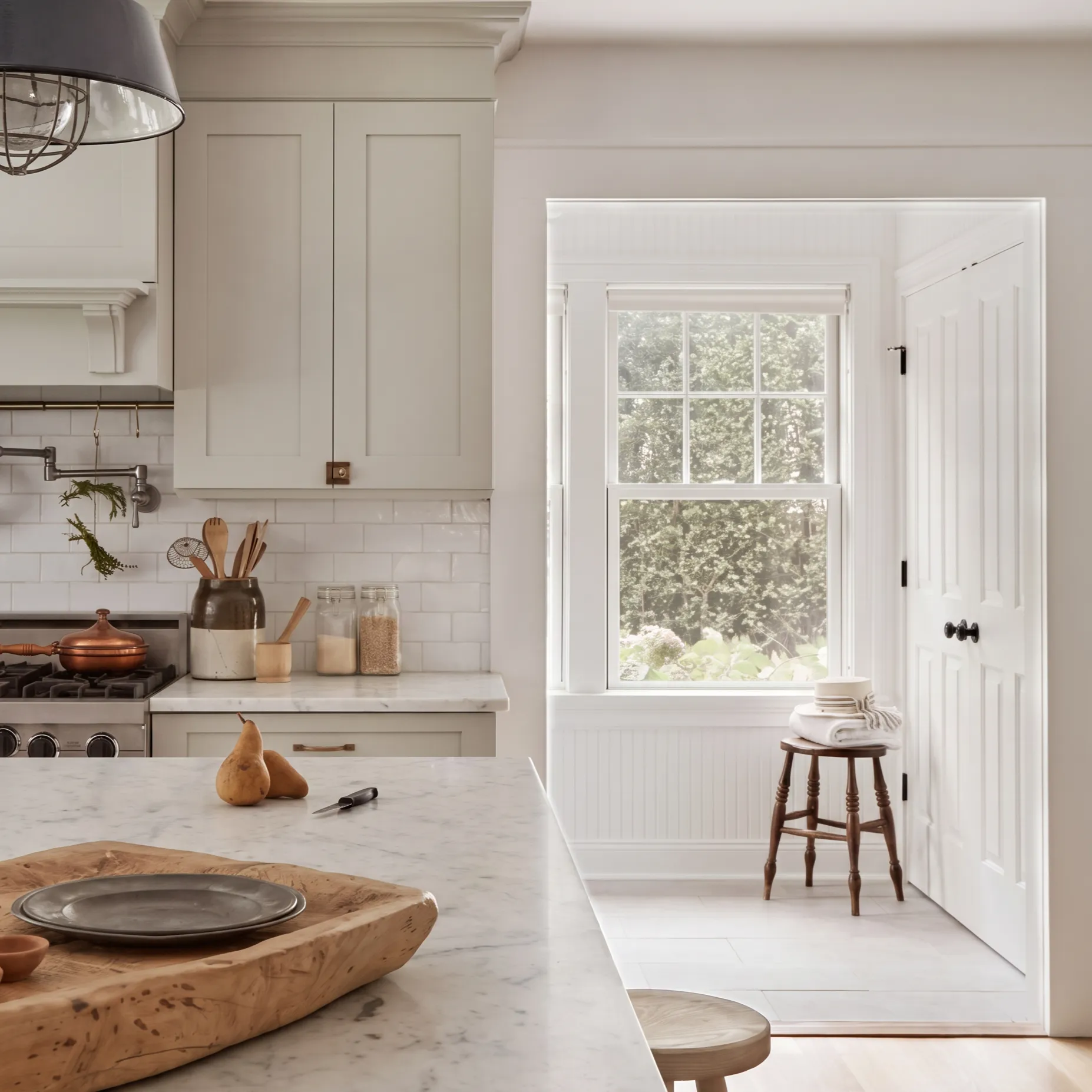
The base is warm: soft whites, light greys, beige. Muted browns, blues and greens act as accents, and blue appears so often that it works almost as a neutral.
Neutrals are layered tonally rather than matched. Cream against ivory against soft grey gives depth. A single flat white does not.
Keep the whole palette to roughly three to five colours, with no more than one or two accents used sparingly.
A concrete combination that works: about 60 percent warm white on the walls, about 30 percent pale oak and warm beige in the furniture and floor, and about 10 percent in a muted sage accent, plus small doses of charcoal for definition.
One rule matters more than the rest: keep the whites warm. A blue-white wall is the single most common way this palette goes cold.
The palette has also moved. Houzz has documented Nordic interiors shifting away from pale cool shades toward stronger colour, and Livingetc reports richer, earthier neutrals such as warm sand, taupe and muted brown, alongside a darker variation built on charcoal, forest green and navy.
Materials and texture
Pick three materials to carry the room and let everything else appear in small doses.
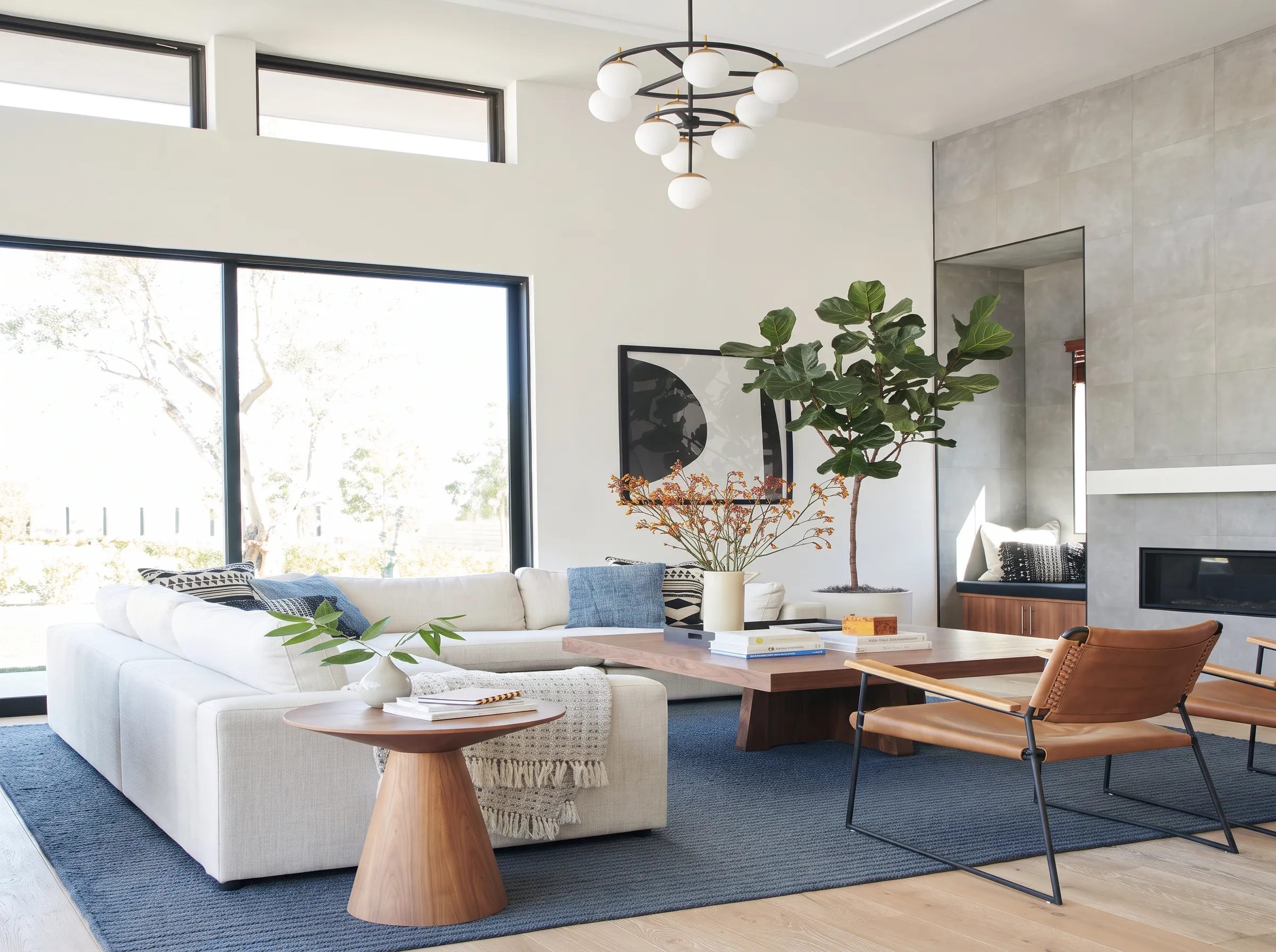
Light wood is the obvious first, for warmth and visible grain. Wool and linen are the second, in rugs, throws and cushions, because a Scandinavian room without soft textiles is just a bright empty room. Leather is a good third, especially on a chair or ottoman, since it warms as it ages and adds a richness that fabric cannot.
Around those three, use small quantities of everything else. Rattan and woven fibres add craft and lightness. Ceramics bring handmade irregularity to a shelf or table. Glass, particularly in a lamp shade, diffuses light instead of blocking it. Metal in brass, steel or darkened bronze belongs in hardware and light fittings, in small amounts. Stone works as an accent that grounds a corner.
The test is atmosphere, not authenticity. If a surface invites touch, it is doing its job.
Scandinavian, Japandi or mid-century modern
These three get confused constantly, usually because they share a palette in photographs. Side by side the differences are easy to see.
Scandinavian | Japandi | Mid-century modern | |
|---|---|---|---|
Mood | Light, calm, lived-in | Serene, grounded, imperfect | Bold, optimistic, expressive |
Palette | Warm whites, greys, pale wood | Charcoal, earthy brown, sage, ochre | Neutrals with mustard, olive, terracotta |
Materials | Light wood, wool, linen, leather | Dark wood, stone, ceramic, lacquer | Teak with plastic, metal, moulded ply |
Lighting | Layered low sources, warm and diffused | Soft, low, diffused | Sculptural statement fixtures |
Furniture silhouette | Light, leggy, slim, pale | Low-profile, close to the ground | Organic curves, tapered legs |
Japandi is essentially a Scandinavian foundation with Japanese wabi-sabi added, which is why it sits darker and lower. Mid-century modern overlaps heavily with Scandinavian, and the two mix well in the same room.
How to get the look, step by step
1. Clear the room and plan the walking route first. Before choosing anything, decide how people cross the room. Mark the walkway and protect it. The Swedish idea of lagom, meaning just right, applies here: pared back, not stripped bare.
2. Set the shell and fix the palette. Warm white or soft grey walls, the lightest floor you can live with, minimal window covering. Do this before buying furniture, because the shell decides how everything else reads.
3. Choose anchor pieces, few and good. The sofa sets the orientation of the room. Look for a visible pale frame and raised legs. Fewer, better pieces beat a full matching set, and this is the step where a shallower or wider piece built to your actual wall solves problems a catalogue cannot.
4. Layer texture immediately after. A rug, two or three cushions in different weaves, one wool throw. Do this in the same week you place the furniture, not months later, otherwise the room stays cold and you blame the style.
5. Build the lighting properly. Frida Ramstedt suggests planning five to seven lighting points per room, mixing general, task, spot and atmospheric light at different heights, on dimmers. Meik Wiking describes the goal as small caves of light around the room rather than one big lamp on the ceiling. Keep bulbs warm, around 2700K to 3000K, and diffuse them with fabric, frosted or opal shades so the bulb is never visible.
6. Add personality last. A few ceramics, one or two pieces of art, plants, objects that are actually yours. This step is what separates a room from a showroom.
The measurements worth getting right
This style has almost no decoration to hide behind, so proportion carries the room. These are the numbers we build to in the workshop.
- Dining chair seat height: 44 to 46 cm. The Wegner CH24 sits at 45 cm, the Fritz Hansen Series 7 at 46 cm.
- Lounge chair seat height: 37 to 40 cm. Noticeably lower than mainstream upholstery, which is part of why these rooms feel relaxed.
- Dining table height: 74 to 75 cm, within a standard range of 71 to 76 cm.
- Coffee table: about 40 cm high, no longer than two thirds of the sofa, with a 30 to 40 cm gap from the sofa edge.
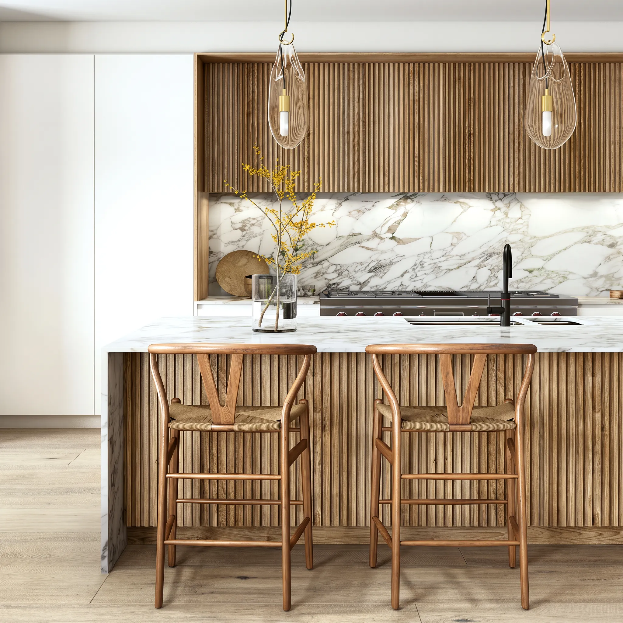
- Pendant over a dining table: 55 to 70 cm above the tabletop, with multiple pendants about 80 cm apart and a diameter between one third and one half of the table width.
- Dining circulation: at least 90 cm from table edge to wall, 105 to 120 cm if you want to walk behind a seated guest.
- Dining rug: extend at least 60 cm past the table on every side, so chairs do not catch on the edge.
Across the board, Scandinavian pieces run lower, shallower and slimmer than standard contemporary furniture. That difference is the whole point.
Get a free quote for a sofa built to your room’s real dimensions. In a narrow living room, a standard 95 cm deep sofa can pull the walkway below 90 cm and the room stops working, no matter how good the sofa is. A few centimetres of depth, decided by your floor plan rather than a catalogue, is usually the fix. Send us your measurements and we will come back with a drawing and a price.
Doing this in a modern home without it looking like a showroom
You need fewer characteristic pieces than you think. A neutral shell, layered texture and one or two recognisable pieces, a sculptural pendant or a pair of wooden chairs, already read as Scandinavian.
Keep these authentic: the light shell, the natural materials, the layered warm lighting, and the restraint that leaves space empty.
These can be entirely contemporary: the colour, which has moved warmer and moodier anyway, the sofa, and the mix. Scandinavian works as a backdrop for Japandi, for mid-century pieces, or for a warmer transitional mix of eras.
Mix old and new deliberately. Two vintage wooden chairs against a soft modern sofa looks like a home. Six matching pieces from the same collection looks like a display. A solid old chair is usually worth restoring rather than replacing, and a restored frame gives you the age that new furniture cannot fake.
The style has been copied into an internet cliché of pale sofa, pale rug, one shelf. What separates the real thing is function, proportion and the evidence that someone lives there.
What usually goes wrong
Everything is white, and the white is cold. Flat white on the walls with white furniture gives you a clinic. Warm the whites, layer the neutrals tonally, and add at least one darker anchor.
The room is minimalised past the point of function. Storage gets removed because it looks heavy, and within two months the clutter is back on every surface. Lagom means enough, not none. Build the storage in and keep the surfaces clear.
One ceiling light does all the work. This is the fastest way to make a warm palette look grey. Five to seven light sources at different heights, warm bulbs, diffused shades.
Texture is treated as optional. Clean lines with no wool, no linen, no sheepskin and no pattern gives you a lifeless room. Pattern and colour have always been part of this tradition. Neutral does not have to mean empty.
For hotels, cafés and offices
At commercial scale the priorities change. Light gets engineered rather than found: larger glazing, glass partitions, reflective surfaces and open plans, with layered ambient and task lighting so the space works from morning to closing.
Materials need to be natural and hard-wearing at once, which usually means light oak or birch tables, wool, leather and stone.
Repeatability is the practical constraint. Twenty tables need to match in finish, height and tolerance, and to still match when you order six more next year. Circulation clearances matter more than at home, and seating has to stay comfortable over hours rather than minutes, which is where those lower Scandinavian seat heights need checking against actual use.
Frequently asked questions
What is the difference between Scandinavian and minimalist design?
Scandinavian design is warmer and more permissive. Minimalism is a philosophical position about owning less, and it tends toward industrial materials such as chrome, glass and concrete. Scandinavian design is pragmatic, uses wood, wool and other natural materials, and allows the colour and the personal objects that minimalism would remove.
Is IKEA Scandinavian design?
IKEA made the aesthetic available worldwide, but it is not the same thing. Authentic Scandinavian interiors usually combine well made pieces, often designed and built to last, with a few things chosen for craft rather than price. The look is a set of principles, not a supplier.
How high should a pendant light hang above a dining table?
Between 55 and 70 cm above the tabletop, depending on the size of the pendant. If you are hanging several, space them roughly 80 cm apart, and choose a diameter between one third and one half of the table width.
How do I make a Scandinavian room cosy instead of cold?
Warm the light and add texture. Replace cool bulbs with warm ones around 2700K to 3000K, spread the light across five to seven points, and layer wool, linen and sheepskin over the hard surfaces. Cold Scandinavian rooms are almost always a lighting problem first.
Start with the room you have
Scandinavian design rewards accurate proportion more than any other style, because there is no ornament to hide behind. A piece that is 8 cm too deep or 6 cm too tall will look wrong even if everything else is right.
Send us the measurements of your room, or a few photos, and tell us what you have in mind. We will build it to those measurements. Formo has been building furniture in Tirana for more than 30 years, and most of that work starts exactly this way.
Request a free quote for your living room, or book a visit to the workshop.
You can also browse finished work from the workshop, where these proportions show up in real rooms.