Art Deco Interior Design: 10 Elements That Define It
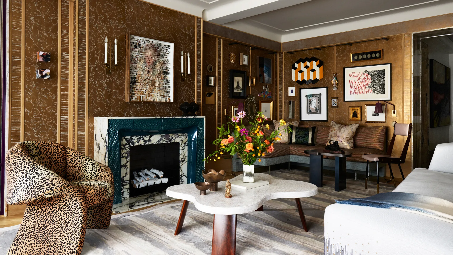
Art Deco is a geometric, symmetrical style built on flat planes, strong verticals and disciplined ornament. Most people confuse it with Art Nouveau, which is its opposite: curving, organic, plant-like and from an earlier generation. Deco came after, and it was never meant to be loud. Done properly it reads as ordered and controlled, not theatrical.
Not sure this is your style? Compare it against eleven others in our guide to interior design styles.
Key takeaways
- Art Deco is geometry and symmetry first. Gold is a finish, not the style.
- One saturated colour leads the room. Everything else stays neutral.
- Reflective surfaces need shadow, or shine turns into glare.
- Deco seating sits lower and deeper than most contemporary sofas.
- Two or three characteristic pieces carry the look. A full theme kills it.
What Art Deco actually is
Art Deco took shape in France in the 1910s, arrived publicly at the 1925 Paris Exposition Internationale des Arts Décoratifs et Industriels Modernes, and faded around 1939. Sources draw the boundaries differently, some starting the clock at 1919, but the 1925 exhibition is the fixed point. Historical revival styles were banned from it, which tells you what the style was rejecting: the ornamental curves of Art Nouveau and the borrowed grandeur of nineteenth century revivalism.
The V&A makes a useful correction here. Art Deco is not one tidy style but a mix of sources, from Cubism to Egyptian and Aztec motifs to the Ballets Russes. The name itself came later, popularised by the historian Bevis Hillier in 1968. At the time, people called it Style Moderne.
What holds it together is an attitude: ornament made mathematical, machine-age optimism, and a preference for order over sentiment.
How to recognise Art Deco in a room
Geometry and symmetry. Zigzags, chevrons, sunbursts, stepped forms, and layouts built around a centre line. The effect is a room that feels composed rather than assembled. Symmetry does a lot of the work, and it is the cheapest Deco signal to add.
Verticality and stepped silhouettes. Cabinets, mirrors and lighting that step upward in tiers, borrowed from skyscraper profiles. This pulls the eye up and makes a standard ceiling height feel taller than it is.
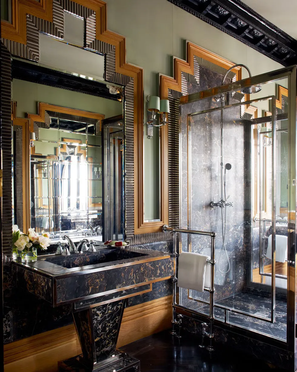
Generous visual weight. Wide sideboards, deep sofas, substantial console tables. Deco furniture anchors a room instead of receding into it. In a small flat this is a risk, which is why scale needs deciding before anything is bought.
Reflective surfaces used deliberately. Mirror, glass, polished stone and metal bounce light around and make a dim room read brighter. They only work against matte surfaces and pooled shadow. Light every surface evenly and the whole thing goes flat.
Ornament that repeats. Fluting, inlay, stepped trim, banding. Deco decoration is precise and rhythmic, never busy. If you cannot see the repeat, it is not doing its job.
Furniture that meets the architecture. Wall panelling, cove lighting hidden above a cornice, fluted millwork running behind a sofa. This is where Deco separates from a shopping list of Deco objects.
The Art Deco colour palette
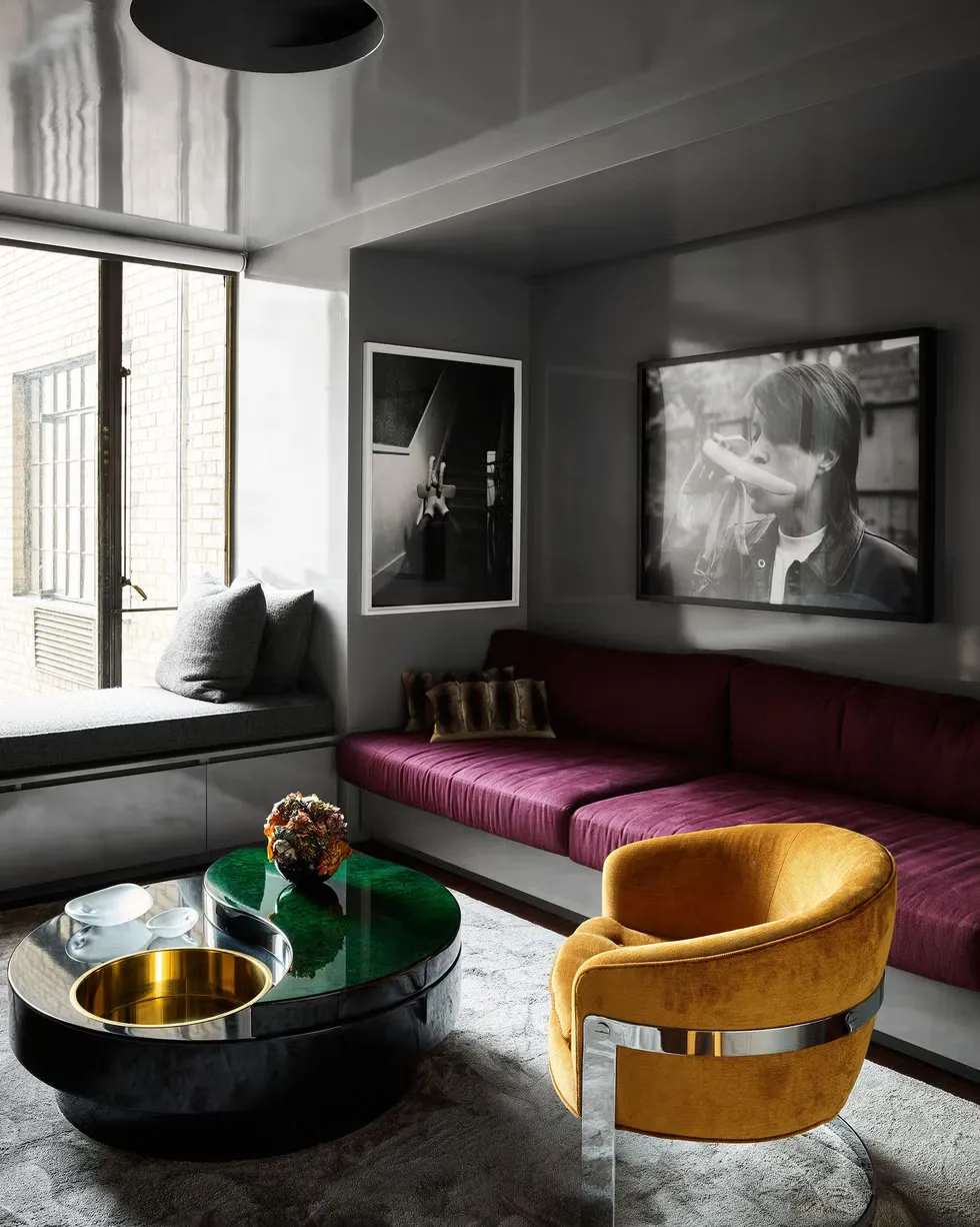
The base is neutral and does not move: cream, beige, dove grey, black. Onto that goes one saturated colour with real depth, usually emerald, sapphire, ruby or amethyst, and then metallic accents in brass, gold or chrome.
The count matters more than the choice. One hero colour carries the room. Reaching for every jewel tone at once is the single most common colour error in Deco, and it produces a room with no hierarchy.
A combination that works in almost any space: cream walls, an emerald velvet sofa, a black lacquered low table, brass in the lighting and hardware.
Worth knowing: the 1920s palette also included soft pastels, peach, mint, powder blue and dove grey, which most people have never associated with the style. Current practice leans that way again, with designers building on earthier, quieter bases and letting the jewel tone appear as a moment rather than a wall-to-wall statement.
Materials and texture
Think of the palette as three materials: dark polished wood, stone and brass. That is the spine. Everything else is texture around it.
Polished, lacquered wood gives Deco its depth. A high gloss surface reads almost liquid under lamplight, which is why one glossy piece per room is usually enough. More than that and the room starts reflecting itself.
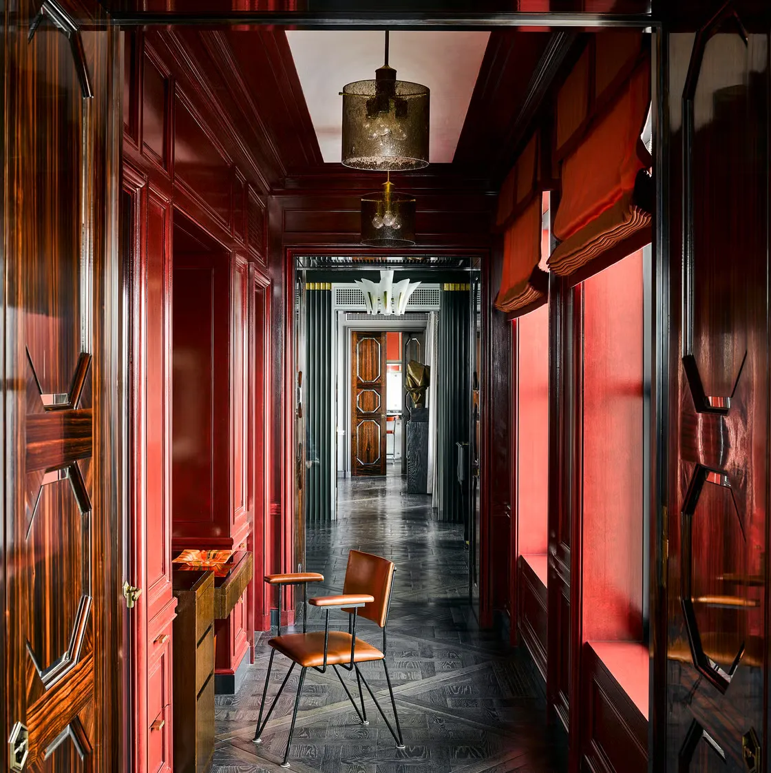
Stone brings the coolness and the contrast, most obviously in black and white marble floors and tabletops. Brass and chrome supply the machine-age shine, best used in thin lines: a trim, a base, a light fitting.
Around those, texture does the softening. Velvet is the quintessential Deco fabric because it holds light in the pile and changes as you cross the room. Leather adds weight. Etched or frosted glass diffuses light instead of throwing it. Plaster cornices and coved ceilings give you soft indirect light without a single visible fixture.
Art Deco compared to the styles it gets confused with
Deco gets confused with the style that came before it and with the one that borrowed its glamour afterwards. Set side by side, the differences are easy to see.
Art Deco | Art Nouveau | Hollywood Regency | |
|---|---|---|---|
Mood | Ordered, glamorous, controlled | Organic, romantic, flowing | Playful, theatrical, eclectic |
Palette | Neutral base, one jewel tone, metallics | Muted earth tones, mustard, olive, burnt orange | Pastels, pink and turquoise, gold heavy |
Materials | Lacquer, chrome, marble, velvet | Wrought iron, stained glass, carved wood | Lacquer, mirror, gilt, silk |
Lighting | Sculptural, geometric, symmetrical pairs | Stained glass shades, organic forms | Ornate, gilded, decorative |
Furniture silhouette | Angular, stepped, symmetrical, heavy | Curving, appearing to grow from the floor | Softer edges, high ornament |
Best suited to | Rooms with height, hotels, bars, formal living | Period houses, detail-rich interiors | Bedrooms, dressing rooms, statement spaces |
How to get the Art Deco look, step by step
1. Set the layout and find the centre line. Before buying anything, decide what the room is symmetrical around: a window, a fireplace, the longest wall. Deco depends on that axis. Today's job is simple, stand in the doorway and identify which wall the room is actually organised around.
2. Choose the anchor. Designers split on this. Some argue you start with one piece with real presence, a sculptural lamp or a strong mirror, because a single object is easier to introduce than a sofa. Others argue authentic Deco is a cohesive whole with no standout piece at all. Both camps agree on restraint, so start with one piece and stop there until the room tells you what is missing.
3. Set the palette, one hero colour only. Neutral walls, one saturated colour on the largest upholstered item, metallics reserved for hardware and lighting. Write the three colours down and do not add a fourth.
4. Layer materials and texture. Introduce the architectural detail here: panelling, fluting, a banded rug that follows the room's geometry rather than fighting it. Mix one glossy surface, one matte, one soft. A rug that runs at an angle to the furniture undoes everything above it.
5. Treat lighting as sculpture. Deco fixtures are objects first and light sources second. Use pairs for symmetry, one statement piece as the focal point, and keep some of the room in shadow. This is the step most people skip, and it is the one that makes the materials work.
6. Add metallics and styling last, sparingly. Once the room reads correctly, add the brass tray, the sunburst mirror, the geometric ceramic. If you can remove half of it without the room losing its identity, it was styling, not Art Deco.
The measurements worth getting right
- Sofa seat height: 38 to 43 cm for a Deco lounge posture, against a standard 43 to 48 cm
- Sofa seat depth: 61 to 71 cm at the deep end, where Deco sits, against a standard 53 to 61 cm
- Dining table height: 71 to 76 cm, with chair seats at 45 to 51 cm and a 25 to 30 cm gap between seat and tabletop
- Circulation: 75 to 90 cm around a sofa, 90 to 100 cm behind a dining chair so someone can stand and pass, at least 60 cm between sofa and coffee table
- Pendant height: the bottom of the fixture 75 to 85 cm above the tabletop, and at least 210 cm of floor clearance anywhere people walk
- Rugs: front legs of the seating on the rug, 20 to 45 cm of floor showing at the edges, and a dining rug extending 60 to 75 cm past the table so chairs stay on it when pulled out
The gap between those two seat heights is the whole practical argument. A Deco room built on standard-height, standard-depth seating will look correct in photos and feel wrong to sit in.
Symmetry is where this gets difficult in a Tirana flat. A living room wall that runs 287 cm will not take a 180 cm catalogue sideboard without leaving two uneven gaps, and a balcony door or a radiator usually rules out the matched pair the composition needs.
Get a free quote for furniture built to your wall. Send us the wall measurements and photos and the axis stays intact instead of being approximated.
How to do Art Deco in a modern home without it looking like a showroom
Keep the geometry, the symmetry and the real materials. Genuine lacquer, weighty brass and proper velvet are what separate Deco from Deco-flavoured. These are worth the money.
Let everything else be contemporary. Silhouettes can be softer and more comfortable than a 1930s original, the palette can sit on an earthier neutral than pure cream, and Deco mixes well with mid-century pieces because both are built on clean line and visible proportion.
How few pieces are enough? One hero, usually a fluted cabinet, a sunburst mirror, a brass-inlaid console or a statement pendant, plus two supporting details that echo its geometry. That is a Deco room. Adding a sixth Deco object does not make it more Deco, it makes it a set.
Curved forms are also legitimate. Waterfall consoles and curved sofas were part of the vocabulary and they take the hardness out of a small room.
What usually goes wrong
Treating the style as a checklist. Black lacquer, gilt, velvet, fans, mirrors and pattern all in one room, all at once. The result flattens instead of building. Deco is a decision you make once in a room, not on every surface.
Shine with no shadow. Mirror wall, glass table, chrome legs, metallic wallpaper, and even downlighting across all of it. Reflective materials need matte neighbours and pooled light. Without shadow, shine becomes glare.
Every jewel tone at once. Emerald sofa, sapphire chair, ruby cushions, amethyst throw. Pick one to lead and let the others go. That kind of density is a maximalist move, and it works there because a repeated colour or motif holds it together. Deco has no such thread to lean on.
Undersized mirrors and art. Deco tolerates oversized far better than it tolerates timid. A sunburst mirror that looks slightly too big on the wall is usually the correct one.
Art Deco for hotels, cafés and offices
At commercial scale, symmetry stops being decorative and starts doing navigation. A centred axis through a lobby tells people where to walk. Statement lighting marks the arrival point in a volume too big for furniture to organise.
Cohesion comes from repeating one material moment rather than adding more of them: the same stone at reception and on the bar top, the same brass profile across every fixture. That repetition is also what makes quantities hard to source from a catalogue, since finishes have to match across ten or forty pieces.
For bars and cafés, darker Deco works better, green or black with brass, banquette seating, mirrored back bars. For offices, fluted detailing and geometric rugs give visual authority without heavy ornament. Seating comfort is judged over hours, not minutes, so seat depth matters more here than anywhere else.
Frequently asked questions
What is the difference between Art Deco and Art Nouveau?
They are opposites. Art Nouveau, roughly 1890 to 1910, is organic, curving and drawn from plant forms. Art Deco, 1920s and 1930s, is geometric, angular and symmetrical. The First World War is the usual dividing line between them.
Is Art Deco coming back?
It is in active use, but in a quieter form than the 1920s original. Current interpretations keep the geometry and symmetry while working on earthier neutral bases, with jewel tones appearing as accents rather than covering the room.
How do I add Art Deco to a modern home without a full renovation?
Start with lighting and mirrors. A sculptural pendant, a pair of matching lamps and one oversized geometric mirror will shift a room's character without touching the walls. Panelling and fluting come later, if at all.
What colours are typical in Art Deco?
A neutral base of cream, beige, dove grey or black, one saturated jewel tone, and metallic accents in brass, gold or chrome. Soft 1920s pastels, peach, mint and powder blue, are also authentic and much less used.
Send us your measurements
Art Deco lives or dies on proportion and symmetry, and both of those are decided before anything is built. If you have a wall that will not take a standard piece, a room that needs a matched pair, or a hospitality fit-out where finishes have to repeat across quantities, that is a measuring problem before it is a shopping problem.
Formo has been building custom furniture in Tirana for over 30 years, for apartments and for hotels, cafés and offices.
Send us your room measurements and photos for a free quote, or come and see the workshop.
You can also browse finished work from the workshop, where the materials in this guide show up in real rooms.