Maximalist Interior Design: A Bold Home Without Clutter
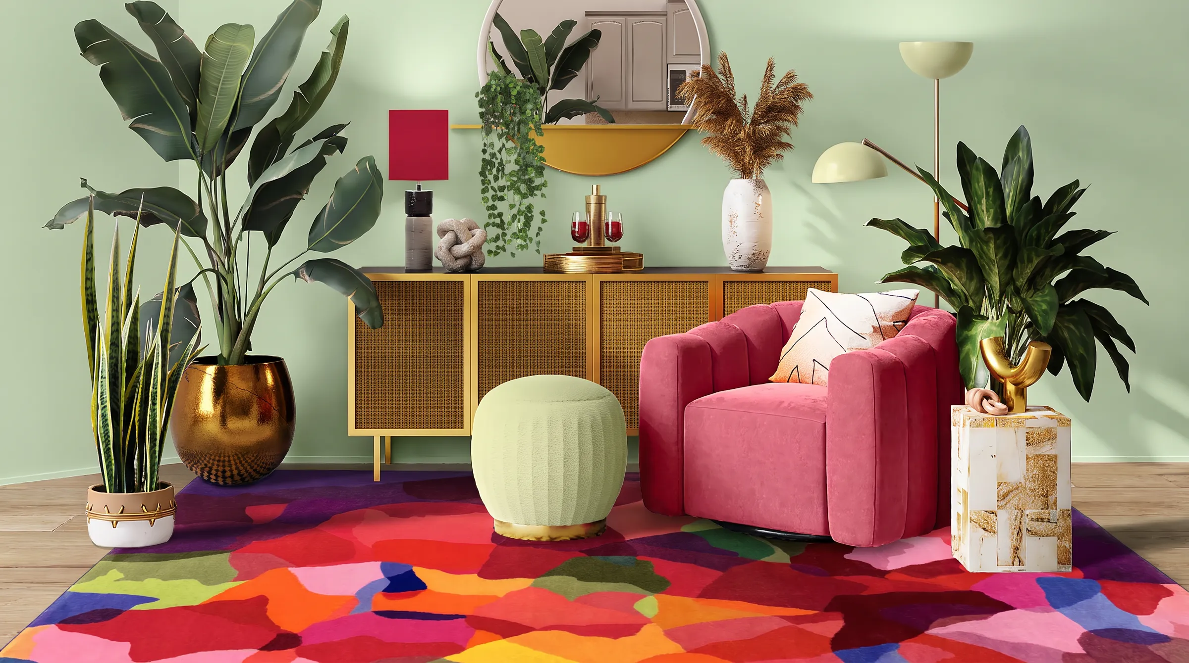
Maximalist interior design is intentional density, not clutter. The difference is a unifying thread, a colour, motif or material that repeats across the room so every object has a reason to be there. Clutter accumulates by accident. A maximalist room is composed, and it can work with far fewer pieces than people assume.
Not sure this is your style? Compare it against eleven others in our guide to interior design styles.
Key takeaways
- Cohesion is the test, not quantity. One repeated colour or motif holds a busy room together.
- Start with one anchor piece and pull the whole palette out of it.
- Around three colours or patterns at different scales, linked by one shared shade, is the working rule.
- Seat heights, table heights and walkway widths do not bend. Only visual weight goes up.
- Leave a few deliberate rest corners so the eye has somewhere to land.
What maximalist interior design actually is
Sources draw the starting line in different places. Some trace maximalism back to Baroque and Rococo interiors and Victorian eclecticism, while others date the named movement to the late 1970s and 1980s, when the critic Robert Pincus-Witten applied the word to Neo-expressionist art and Ettore Sottsass founded the Memphis Group in Milan in 1980. Either way, the argument it was answering is the same one Robert Venturi made in Complexity and Contradiction in Architecture in 1966, when he answered less is more with "less is a bore."
What maximalism removes is the requirement that a room stay quiet. What it prioritises is layering, personality and the visible evidence of a life. What it demands in return is editing, because density without a governing idea is just mess.
How to recognise a maximalist room
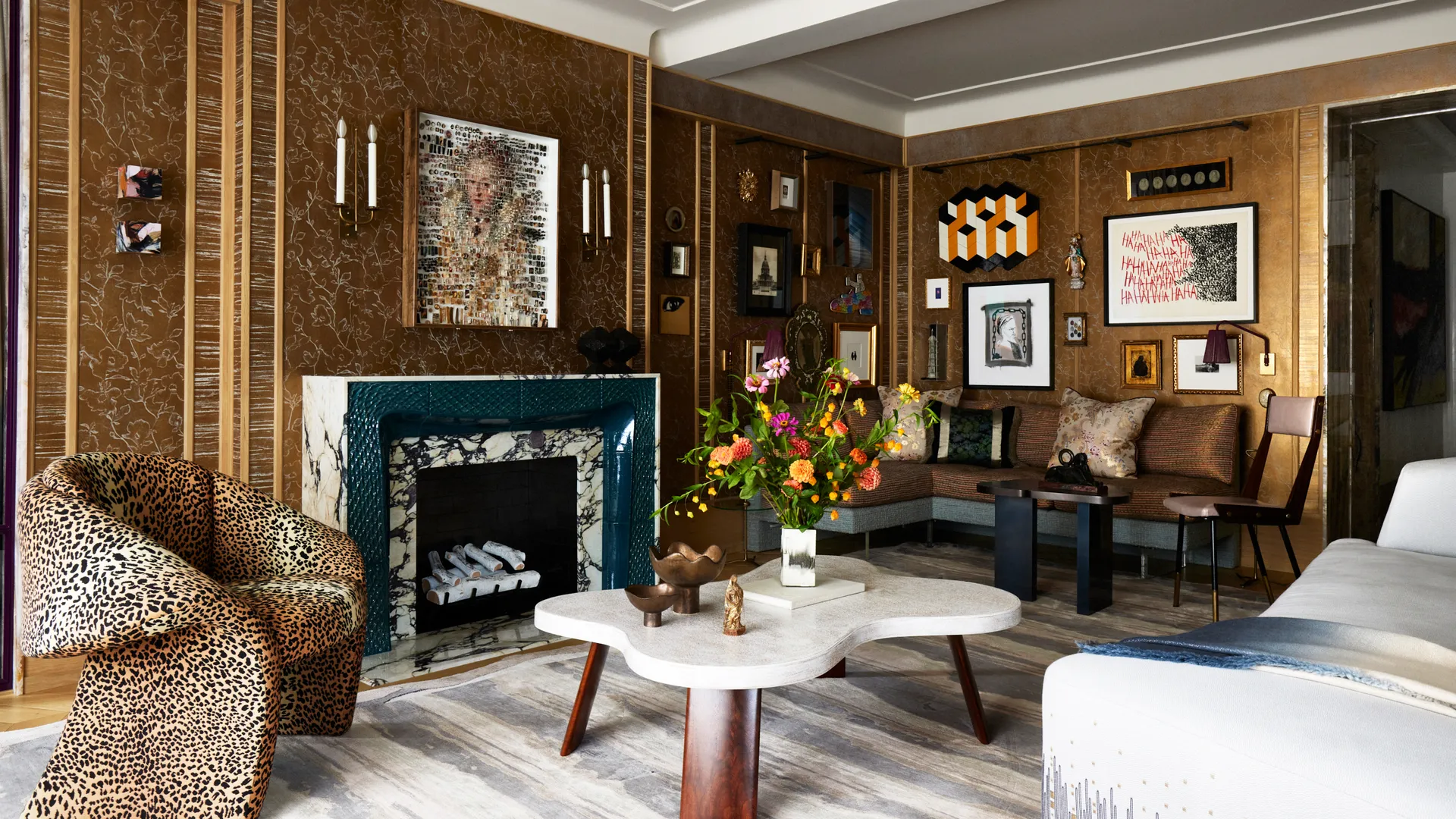
Colour drenching. Saturated paint or wallpaper carried across walls, trim and the ceiling. Treating the ceiling as a fifth surface closes the room in and makes it feel enveloping rather than tall and empty.
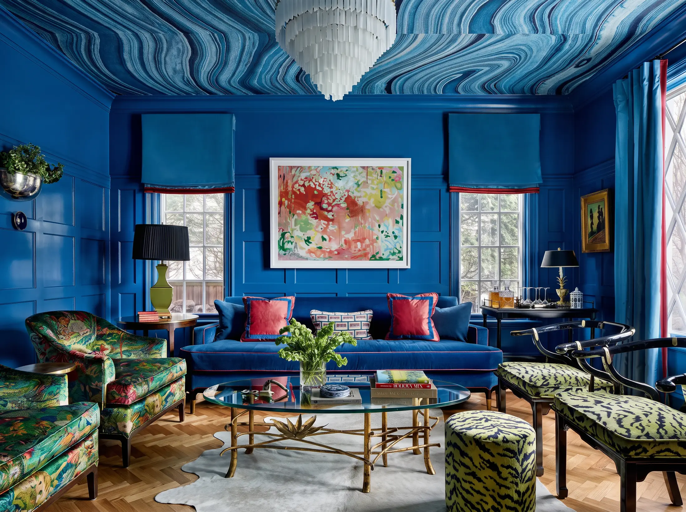
Pattern on pattern at different scales. A large print, a medium one and a small one, tied together by a shared colour. Varied scale creates movement and depth. Patterns at the same scale fight each other and read as visual noise.
Layered textures. Velvet against stone, a woven rug over a hard floor. The contrast between soft and hard is what makes the room feel sensory instead of flat.
Dense gallery walls and open display. Art hung high and close, shelves left visible rather than shut away. This pulls the eye upward and gives the room a narrative.
Statement furniture that meets the architecture. Large anchor pieces sized to the volume of the room. Big pieces ground the density. Undersized ones let it float and look accidental.
Deliberate rest corners. Most surfaces are active, but a few are left blank on purpose. Those pauses are what separate abundance from chaos.
The maximalist colour palette
The typical palette runs to jewel tones, emerald, sapphire, navy, violet and fuchsia, with metallic punctuation in gold, brass or copper, often over a dark ground of black, navy or deep green. Neutrals still appear, but as anchors rather than the main event: a linen sofa, a plaster wall, something for the eye to rest against.
The working rule is around three strong colours or patterns at different scales, connected by one shade that shows up in all of them. A concrete combination: emerald green walls, mustard or ochre in the textiles, navy in the upholstery, with brass tying it together.
The palette has been shifting. The ninth annual 1stDibs Interior Designer Trends Survey, covering 468 design professionals worldwide and released in November 2025, found chocolate brown named by 33% of respondents for 2026, nearly double the 17% recorded in 2022. Burgundy rebounded from 7% for 2025 to 21% for 2026, with dark green and sage also growing. Heritage tones are now doing the work that brighter colours did a few years ago.
Materials and texture
Pick three materials to carry the room and let everything else play a supporting role. Velvet and other pile textiles bring warmth and a shifting sheen that changes with the light. Marble and stone bring weight and a pattern of their own, which is why they turn up so often in hospitality projects where a single surface has to hold attention on its own. Brass and metallic accents work as warm punctuation, catching lamplight and pulling a scheme together.
Around those, plaster and limewash give depth without adding pattern, ceramics and pottery add the collected and handmade note, and rattan or wicker acts as a palate cleanser between two busy printed pieces. High gloss lacquer adds reflection and drama on a single piece. Patterned rugs are often the strongest layering tool in the room, and frequently the anchor everything else is built around.
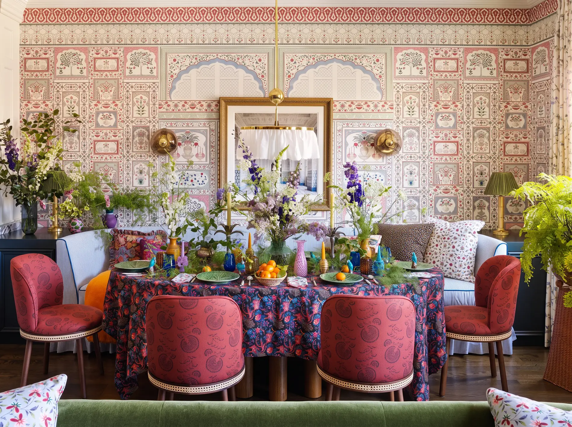
Maximalist, eclectic or bohemian
The three get used interchangeably, and they behave differently the moment you start buying. Set side by side, the differences are easy to see.
Maximalist | Eclectic | Bohemian | |
|---|---|---|---|
Mood | Composed abundance, saturated | Mixed but restrained, can even read as minimal | Relaxed, lived-in, global |
Palette | Any palette, usually saturated, dark grounds common | Variable, often lighter | Earthy and warm |
Materials | Velvet, stone, brass, lacquer, patterned textiles | Whatever the mix calls for | Rattan, jute, macramé, natural fibres |
Lighting | Layered, lamps and statement fixtures | Conventional | Soft and informal |
Furniture silhouette | Large anchor pieces, deep seating | Varied, pieces stand apart | Low, loose, informal |
Best suited to | Rooms with a collection and a clear organising idea | People who want variety while keeping negative space | Casual rooms where structure matters less |
Two neighbours are worth naming as well. Grandmillennial is really a subset of maximalism leaning traditional, with chintz, florals and antiques. Dopamine decor is driven by emotional response rather than density, which is why the designer Bobby Berk described it as intentionalism rather than maximalism. Cluttercore puts everything on display with no single thread running through it, which is precisely the line maximalism holds.
How to get the look, step by step
1. Plan circulation before anything else. Mark your main routes through the room on the floor with tape and keep them clear. Density is only comfortable when you can still walk through the space without turning sideways.
2. Choose one anchor. A bold wallpaper, a patterned rug, or one statement piece. This is the decision everything else answers to, so commit to it before you buy anything else.
3. Pull the palette out of the anchor. Take two or three colours from it, one dominant and the rest supporting, and refuse anything that does not connect to at least one of them.
4. Work from the largest surfaces down. Walls first, then the rug and the floor, then furniture, then art, then the small objects. Doing it in reverse is how people end up with a room full of things that do not agree.
5. Layer texture, then light. Set soft against hard, then build the lighting in layers: table lamps, picture lights over the gallery wall, one fixture that is doing something. A single ceiling light flattens everything you just layered.
6. Style, then take one thing away. Designers borrow Coco Chanel's advice about removing one item before leaving the house. Style the room fully, live with it a week, take one object out. Repeat. A maximalist room is never finished, and that is the point.
The measurements worth getting right
- Sofa seat height: 41 to 46 cm
- Sofa seat depth: 51 to 61 cm, or 61 to 71 cm for the deep lounge seating maximalist rooms tend to use
- Dining table height: 75 to 76 cm, with chair seats at 43 to 48 cm for 25 to 30 cm of clearance
- Main walkway clearance: 75 to 90 cm
- Gallery wall: centre the grouping at 145 cm from the floor, 15 to 25 cm above the furniture, 5 to 7.5 cm between frames, and treat the whole arrangement as one piece
- Pendant over a dining table: 75 to 90 cm above the tabletop
- Dining rug: extend it roughly 60 cm past the table edge so chairs stay on it when pulled out
Maximalism does not bend the ergonomic numbers. Seat heights, table heights and walkway widths stay where they are. What goes up is visual weight: deeper seating, denser hanging, larger anchor pieces.
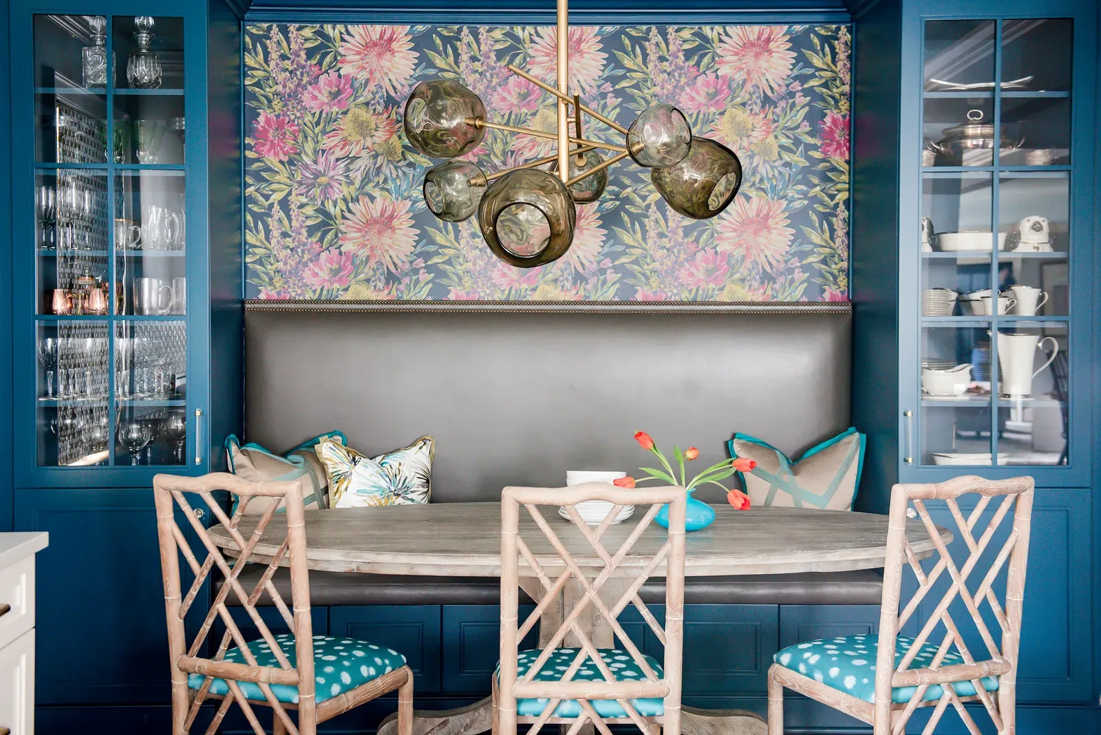
A maximalist room lives or dies on display, and standard shelving rarely fits the wall it is meant to fill. If the alcove is 287 cm wide and the deepest thing going on it is 34 cm, a piece built to both keeps the proportion intact where a catalogue unit leaves a gap that reads as a mistake.
Get a free quote for storage built to your wall. Send us the wall measurements and photos and the display wall fills properly instead of nearly.
How to do this in a modern home without it looking like a showroom
You do not need a period house. Confine full layering to one zone, a gallery wall, a papered ceiling, one bold room in an otherwise calm plan, and the rest of the home can keep a lighter, quieter scheme.
How few pieces are enough is genuinely few. One anchor plus a tight palette can carry a room, because a small number of pieces read as maximalist when they play off each other through repetition or contrast. Bobby Berk's version of this is one bold object placed correctly.
Keep authentic: the personal and collected objects, the layered textiles, the bold colour, the story. Keep flexible: contemporary custom furniture, peel-and-stick wallpaper if you rent, and a restrained heritage palette instead of full jewel tone saturation.
Mix eras rather than reproducing one, which is the single clearest difference between a maximalist room and a themed set. A carved inherited chair, a mid-century sideboard and a contemporary sofa can share a room comfortably as long as one colour runs through all three.
What usually goes wrong
No unifying thread. This is the one that turns curation into clutter. If nothing repeats, the room reads as accumulation.
Colour with no base. Strong colours arriving one at a time with no governing palette. Pull your secondary colours out of a key rug or pattern and the room resolves itself.
Too many small things. Lots of little objects and no large anchors fragments the room. Group the small pieces and let something big hold the composition.
Wrong scale. Furniture too small for the room, or too light for the weight of the pattern around it. Undersized pieces in a heavily patterned room look like they wandered in.
One more worth stating plainly: layering cheap on top of cheap does not become maximalism, it becomes hoarding. Fewer, better pieces layered carefully beats more of everything.
Maximalism for hotels, cafés and offices
At commercial scale the organising thread has to be a narrative rather than a palette. The Fife Arms in Braemar is the reference case, a four year renovation reopened in 2019 with 46 rooms and more than 16,000 pieces, antiques and commissioned artworks integrated throughout. What holds it together is a sense of place, not just a colour.
Two things change at that scale. Rhythm becomes structural: every loud moment needs a pause next to it, or guests stop registering any of it. And the lobby carries a theatrical first impression that the rest of the property then has to live up to.
In offices, gallery walls and large art work as brand focal points, with acoustics and lighting planned alongside them and the rollout phased. All of it depends on quantities of matching pieces, which is where a catalogue runs out and a workshop starts.
Frequently asked questions
What is the difference between maximalism and clutter?
Intent and repetition. Clutter accumulates without a plan, while maximalism repeats a colour, motif or material across the room so each object connects to something else. If you can name the thread running through the room, it is maximalism.
Is maximalism still in style?
Yes, though the palette has moved. The 1stDibs 2025 survey of 468 designers showed heritage tones like chocolate brown and burgundy rising sharply for 2026, replacing the brighter colours of a few years ago. The layering approach has held, the colours changed.
How do you mix patterns without it looking messy?
Vary the scale and share a colour. Use one large print, one medium and one small, all containing a shade in common, and break them up with solid textures. Patterns at the same scale compete and read as noise.
How do I make my home maximalist on a budget?
Start with one anchor: paint, wallpaper or a rug, since the largest surfaces do most of the work. Build the rest out of what you already own, grouped and repeated rather than scattered. Peel-and-stick wallpaper handles the rental problem.
Get the proportions right first
Maximalism is easier than it looks and harder than it sounds. The layering is the fun part. The part that decides whether the room works is scale: whether the sofa is deep enough, whether the shelving fills the wall, whether the walkway survives all of it.
That is where a piece built to your room beats one chosen from a catalogue, particularly in Tirana apartments where balcony doors and radiators eat into the wall you were counting on. Formo has been building to awkward dimensions in Tirana for over 30 years, for apartments and for hotels, cafés and offices.
Send us your room measurements and photos for a free quote, or come and see the workshop if you would rather look at materials in person.
You can also browse finished work from the workshop, where the materials in this guide show up in real rooms.