Minimalist Interior Design: A Calm, Functional Home
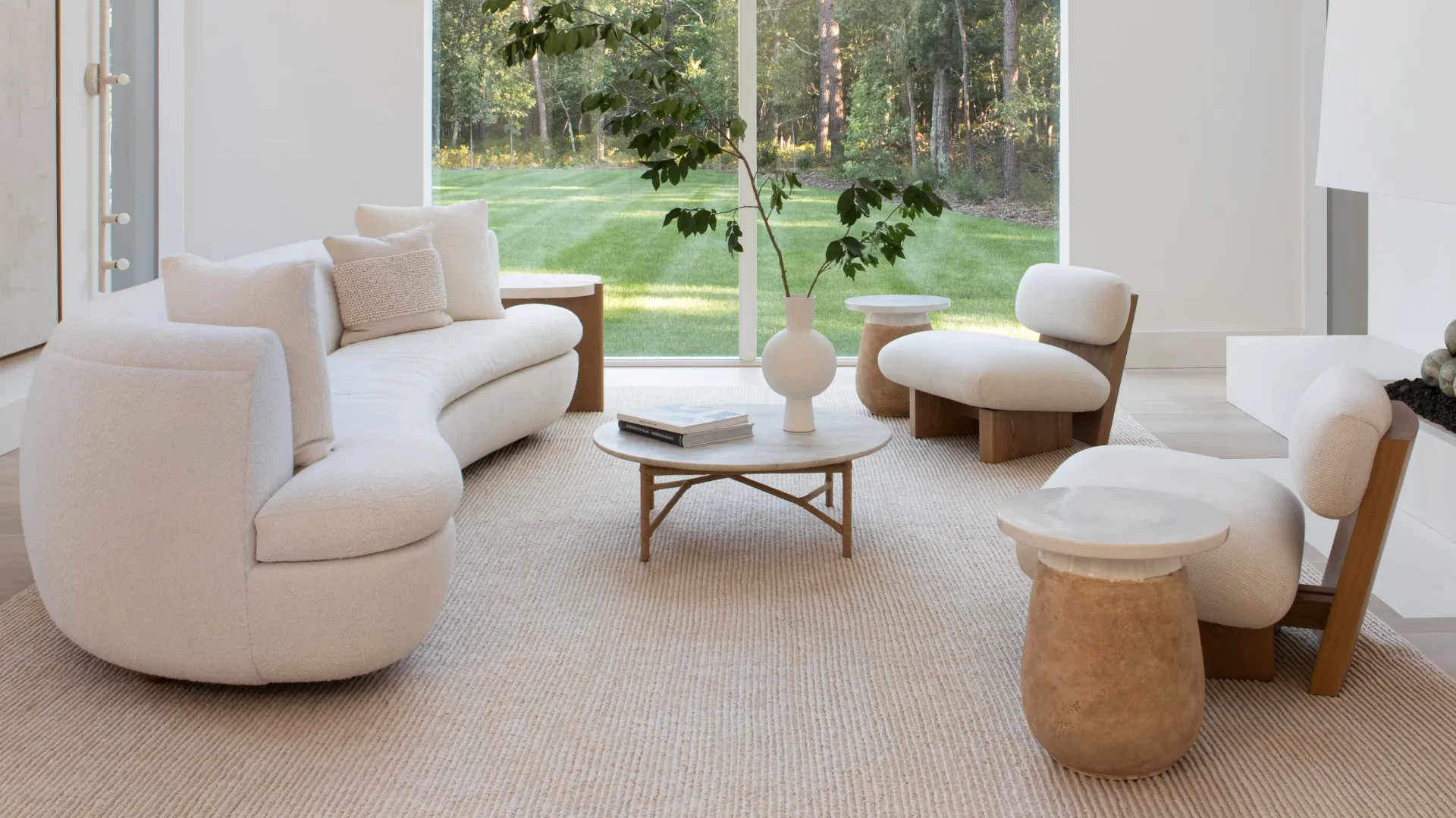
Minimalist interior design is a method of taking things away, not a period style and not an empty room. Modern is the period style, with a fixed historical look. Minimalism is a decision about what to remove, which is why a minimalist room can be warm, wooden and comfortable and still hold almost nothing you do not use.
Not sure this is your style? Compare it against eleven others in our guide to interior design styles.
Key takeaways
- Minimalism is a discipline of subtraction. Modern is a period. They are not the same thing.
- The aim is fewer, better objects with space around them, not bare rooms.
- Warmth comes from texture and daylight, not from adding more objects.
- Storage decides whether the look survives real life. Everything you own is still there, it just lives behind a flat front.
- Two or three colours, one anchor piece and correct measurements do most of the work.
What minimalist interior design actually is
The word arrived from a New York art movement in the 1960s, where Donald Judd, Dan Flavin and Frank Stella reacted against the emotional excess of Abstract Expressionism. In interiors the roots run further back, to the Bauhaus and the "less is more" position associated with Mies van der Rohe, and forward again to architects like John Pawson, whose book Minimum was published in 1996. Sources draw those boundaries in different places, and designers still disagree over whether minimalism leads with function or with form. The opposite position, that less is a bore, came from Robert Venturi in 1966, and it is still the clearest way to see what minimalism is choosing to leave out.
For a room, the principle is simpler. Remove ornament so that space, light and proportion carry the room instead. What is left has to be worth looking at, because there is nothing else to look at.
How to recognise a minimalist room
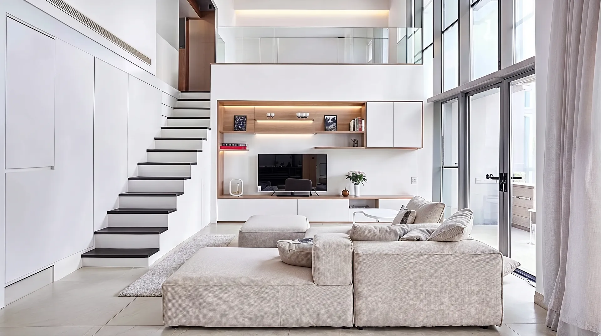
Straight lines and plain geometry. The architecture is left visible and becomes the decoration. Unbroken lines let the eye travel from one room to the next without stopping, which is what reads as calm.
Negative space with a job. Clear floor and clear surfaces are compositional, not accidental. The space around a piece is what makes the piece legible.
Low furniture. Seating and storage sit low and light. Low visual weight raises the apparent ceiling, which matters most in apartments with ordinary ceiling heights.
Storage you cannot see. Handleless fronts and built-in cupboards keep the wall plane uninterrupted. Clutter is designed out of sight rather than tidied away every evening.
Few objects, each one readable. Fewer but better pieces means each one gets noticed instead of competing.
Daylight left alone. Minimal window treatment, daylight as the main source, quiet artificial light layered underneath. Letting daylight carry the room is the one point where minimalism and biophilic design agree completely.
The minimalist colour palette
A neutral base, often several shades of the same colour, with one or two muted accents. Two or three colours in total is the working limit.
That palette has warmed. In the 1stDibs 2026 Interior Designer Trends Survey, based on 468 interviews conducted in July and August 2025, chocolate brown was the top colour designers expected to use in 2026, chosen by 33% of respondents, close to double the 17% recorded in 2022. Terracotta, olive, taupe, sand, mushroom and cream have taken ground that cool grey used to hold. The same warm neutral shift is what drives organic modern interiors, where the palette arrives on curved wood instead of flat planes.
A combination that works: oat linen, light oak, one matte black or brushed brass accent. Keep walls in a warm off-white rather than a pure white, which reads cold in a north-facing room.
Materials and texture
In a pared back room the material is the story. Texture carries the warmth that pattern and objects carry in a busier scheme.
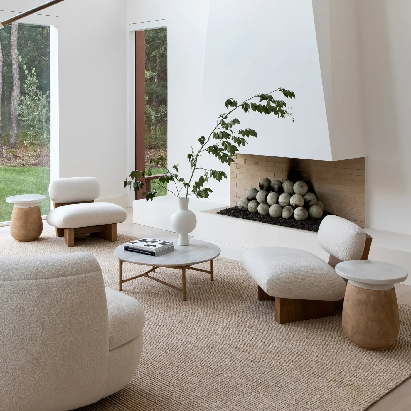
Three materials are usually enough to set the palette: wood, plaster and linen. Oiled wood with visible grain grounds a neutral room. Matte plaster walls hold shadow and shift through the day, so a flat wall stops being flat. Linen creases, and creases read as a house someone lives in.
After that, work in small quantities. Honed stone brings weight and quiet. Brushed brass warms where chrome cools. One handmade ceramic piece adds an irregular surface in a room full of straight edges. Leather and woven cane age visibly, which is useful when everything else is smooth.
Minimalist, Scandinavian or Japandi
The three get confused constantly, and the differences are easier to see side by side. Scandinavian interior design and Japandi both share minimalism's restraint, and both hand something back: light and textile in the first case, craft and visible warmth in the second.
Aspect | Minimalist | Scandinavian | Japandi |
|---|---|---|---|
Mood | Clear, composed, slightly formal | Light, easygoing, openly cosy | Warm, quiet, comfortable with imperfection |
Palette | Neutral, close to monochrome | Whites, pale wood, cool greys | Browns, creams, muted greens |
Materials and texture | Smoother surfaces, less layering | Pale wood, wool, geometric pattern | Heavily layered, tactile, handmade |
Furniture silhouette | Low, straight, unornamented | Light frames, functional shapes | Low, solid, softly finished |
Best suited to | Small flats needing visual quiet | Dark rooms needing lift | Homes wanting warmth over sharpness |
How to get the look, step by step
1. Map how you move before you buy anything. Walk the room and mark the routes between door, window and seating. Keep them clear.
2. Empty the room, then decide what comes back. Take everything out, sort it, return only what has a job. This is step one in every serious guide and the step most people skip.
3. Design the storage before the furniture. Work out what actually has to live in this room, then plan closed storage sized for it. Open shelving looks minimal until it is used.
4. Set the shell and fix the palette. Walls, floor and the two or three colours get decided now, not after the sofa arrives.
5. Choose few pieces and one anchor. One piece leads: a sofa, a dining table, a single artwork. Everything else recedes.
6. Layer light and texture, then edit again. Two to four light sources at different heights, a wool rug, linen curtains. Come back a week later and take one thing out.
The measurements worth getting right
- Sofa seat: 43 to 47 cm high, 53 to 58 cm deep for upright sitting, 61 to 71 cm if you want to lounge.
- Dining table: 71 to 76 cm high, with 76 cm the most common.
- Dining chair seat: 43 to 48 cm, leaving 25 to 30 cm between seat and tabletop.
- Clearance: at least 91 cm behind a seated diner, 112 cm where people pass behind the chairs, 76 to 91 cm in front of a sofa.
- Pendant over a table: 76 to 91 cm above the tabletop on a standard ceiling, diameter about half to two thirds of the table width.
- Rug: front legs of the sofa and chairs on it at minimum, with 30 to 45 cm of floor showing at the edges.
Those numbers are easy on paper and hard against a real wall, especially where a balcony door and a radiator leave an alcove of 212 cm and every stock cupboard comes in at 180 cm or 240 cm.
An alcove of 212 cm and stock cupboards at 180 or 240? Send us the wall measurements and we build the piece to the gap, handleless and full height, so the wall plane stays unbroken.
How to do this in a modern home without it looking like a showroom
Keep the discipline authentic and modernise everything else. The negative space, the edited object count and the clean lines are the style. Palette and materials can be entirely current: warm neutrals, oiled wood, brushed brass instead of chrome.
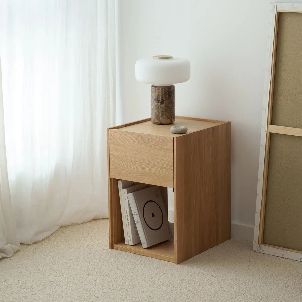
On surfaces, one or two objects is the limit, and a single group of three on an otherwise clear console gives you a focal point. Warmth should arrive through large tactile surfaces rather than many small accessories. A wool rug, linen curtains and one wooden piece do more than fifteen ornaments.
A coffee table with one tray, one stack of books and one bowl reads as used. The same table with nothing on it reads as staged.
What usually goes wrong
Treating calm as empty. Strip a room far enough and it stops being a retreat and starts being a showroom floor. Designers name this as the most common failure.
No texture. Neutral colours plus similar surfaces equals flat and dull. This is the single most cited mistake, and it is fixed with wool, linen and plaster, not with more colour.
One overhead light. A single ceiling source makes any pale room look harsh. Two to four sources at different heights fix it.
Furniture pushed to the walls. It leaves a hole in the middle and the room reads as a waiting area. The small rug floating under the coffee table does the same damage in reverse, cutting the floor into pieces.
For hotels, cafes and offices
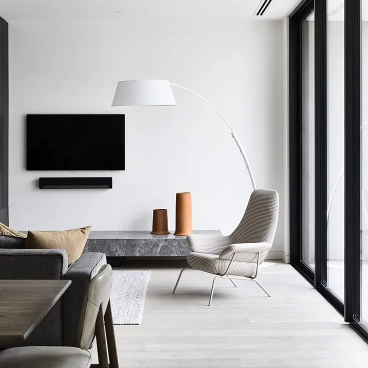
At scale, minimalism has to survive traffic. Lobbies use open, partition-free layouts with low-profile seating and a restrained palette, so one artwork or one furniture line becomes the focal point. Zoning gets done with lighting, rugs and placement rather than walls, which keeps the plan flexible, and the restraint reads as accessible luxury rather than austerity.
Two practical consequences. Furniture takes more punishment, which pushes projects toward built rather than bought. And cafes now double as workspaces, so seating has to stay comfortable over hours, not minutes.
Frequently asked questions
Is minimalism the same as modern?
No. Modern is a historical period style with a defined look. Minimalism is a method of subtraction that can be applied inside modern, contemporary or almost any other setting. A modern room can carry bold accents and plenty of furniture. A minimalist room deliberately does not.
How do you make a minimalist room feel cosy instead of cold?
Add texture, not objects. Wool, linen, matte plaster and oiled wood warm a neutral room without breaking the discipline. Swap chrome for brushed brass, keep walls in a warm off-white, and use two to four light sources instead of one ceiling fitting. If you want to go further in that direction, Japandi is minimalism with the warmth turned up on purpose.
Is minimalist design expensive?
It can be, because fewer pieces means each one is visible and has to hold up. The cost sits in a small number of well-made items and in storage that fits the room, not in volume. Buying less and buying it once is the argument.
Minimalism is mostly a measurement problem once the thinking is done. The alcove is what it is, the wall the sofa faces is what it is, and a catalogue piece either fits or leaves a gap that reads as a mistake. Formo has been building and repairing custom furniture in Tirana for over 30 years. Send us your room measurements and a few photos, or come to the workshop and go through the drawings in person: tell us about your room.
You can also browse finished work from the workshop and see how the fronts, edges and finishes come together before you decide.