Organic Modern Interior Design: Curves & Natural Materials
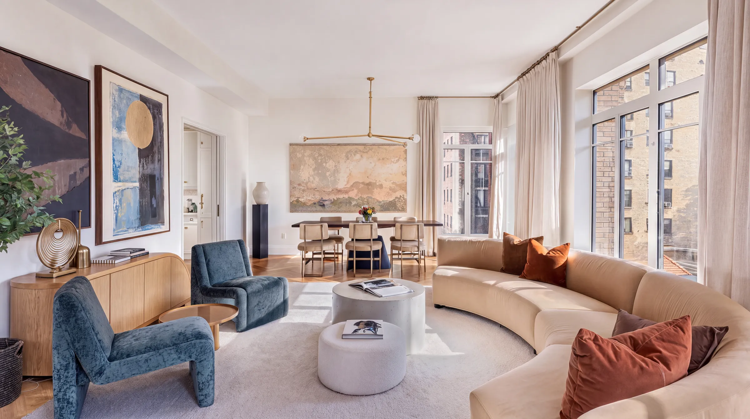
Organic modernism is modernism softened into curves, and the word organic has nothing to do with natural materials, eco credentials or biophilic design. It describes how a design holds together, with every part serving the whole. Once that lands, the sculptural chairs and cleared floors stop looking decorative and start looking structural.
Not sure this is your style? Compare it against eleven others in our guide to interior design styles.
Key takeaways
- Organic refers to the coherence of a design, not to wood, wool or anything green.
- The style's signature move is removing legs, not adding curves.
- One sculptural anchor piece carries a whole room. A matched set kills it.
- The lounge seat sits low, around 38 to 41 cm, well under a standard 45 to 48 cm chair.
- Colour comes mostly from the wood, with one or two saturated accents at most.
What organic modernism actually is
The label is largely retrospective. The people doing the work used two other terms: organic architecture, which Frank Lloyd Wright coined in his 1908 essay for Architectural Record, and organic design, which the Museum of Modern Art used for its 1940 competition and 1941 exhibition, Organic Design in Home Furnishings, run by curator Eliot Noyes.
Noyes defined it simply. A design is organic when its parts are harmoniously organised within the whole, according to structure, material and purpose. Wright put the same idea differently, reworking Louis Sullivan's rule so that form and function became one thing rather than two.
What it was answering: the cold, rectilinear glass box of the International Style. Organic design kept the honesty of modernism and dropped its rigidity. Dates vary by source. Roots reach back to Wright around 1900, the term arrives in 1908, and the furniture moment lands between the 1930s and the early 1950s.
How to recognise organic modernism in a room
The biomorphic silhouette. Curved, free-form shapes borrowed from bodies and shells rather than from geometry. Saarinen's Womb Chair, Noguchi's coffee table, Aalto's Savoy vase. The spatial effect is that the room stops reading as an assembly of rectangles and starts reading as one flowing thing.
The cleared floor. This is the real signature. Saarinen designed his Pedestal group specifically to get rid of what he called the slum of legs, replacing four legs with one stem. An uninterrupted floor plane makes a small room read larger and calmer, because your eye is not counting eight table legs and sixteen chair legs.
Continuous line and cantilever. Aalto's bent birch loops back on itself instead of meeting at a corner. Wright's planes push out and hover. Both create the sense of mass without weight, which is what stops a curved piece from looking bulbous.
A low, horizontal profile. Lounge seating sits low and stretches sideways. This grounds the room and pulls sightlines out towards windows and doors rather than up towards the ceiling.
Furniture that belongs to the architecture. Wright and Aalto both designed buildings, interiors, furniture and glassware as one project. In practice this means furniture that follows the room's lines rather than sitting in front of them.
Ornament from material, not applied. No carving, no trim. The grain, the curve and the surface do the decorative work.
The colour palette
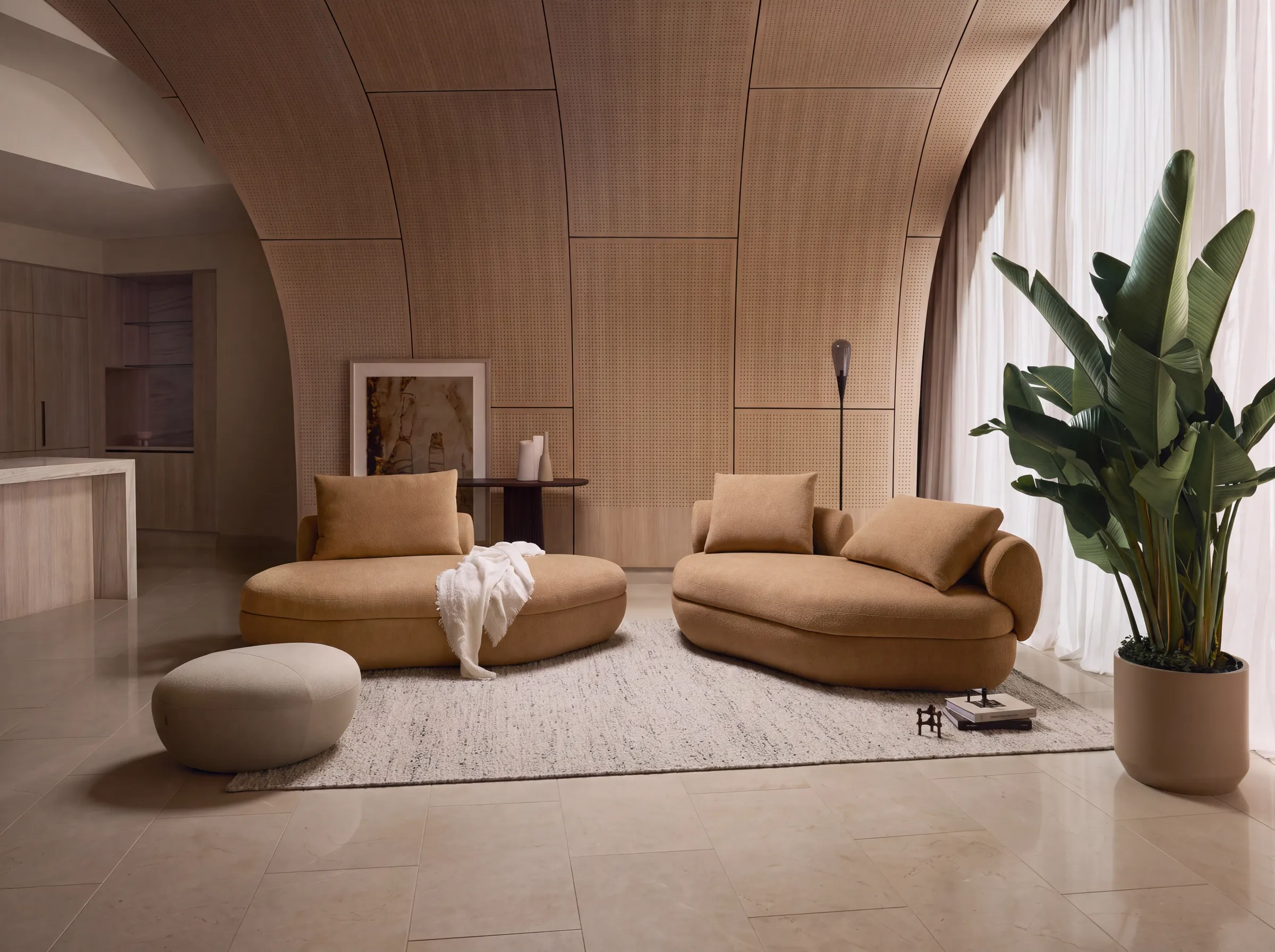
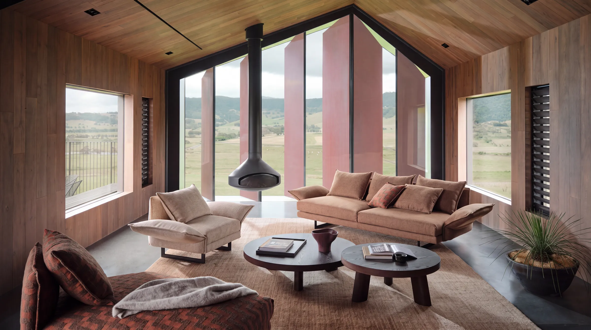
Wood does most of the colour work here. Walls stay pale, in white or cream, doing the same quiet job they do in Scandinavian interiors, and the warm tones of walnut, teak or birch carry the temperature of the room. Against that ground you add one or two saturated accents, no more. Period-typical accents were burnt orange, olive green, mustard and teal.
A combination that works: cream walls, a walnut console, one burnt-orange upholstered chair, and a brass or chrome detail to catch the light.
Worth knowing: today's organic modern decorating trend deliberately strips those accents out in favour of an all-earth-tone scheme of beige, clay, sand and sage. That is a 2020s development, not the historical style. If your room is entirely beige, you have the current trend, not organic modernism.
Materials and texture
Name three materials as your palette and stop there: a warm wood, a smooth moulded shell, and a textured wool or boucle. That trio is the whole atmosphere. The wood brings warmth and, historically, was the very technology that made the curves possible, since bent and moulded plywood is what allowed a seat to become one continuous piece. The moulded shell, originally fibreglass, gives you the seamless sculptural form with no visible joins. Wool or boucle upholstery softens that shell so it invites you in rather than just looking good from across the room.
Everything else is a supporting note. Glass in free-form shapes reads as a floating plane. Stone grounds a room against all those smooth horizontals. Paper does something specific and worth stealing: Noguchi's Akari lamps, made from washi paper and bamboo from 1951, throw a diffuse warm glow instead of a hard pool of light. Metal should almost disappear. The Tulip base is cast aluminium, coated to match the shell precisely so the eye reads one object.
Organic modernism, mid-century modern and today's organic modern
Organic modernism usually gets filed under the broader mid-century umbrella, and our guide to mid-century modern covers that wider period. Side by side, the differences are easy to see.
Aspect | Organic modernism | Mid-century modern | Today's organic modern |
|---|---|---|---|
Mood | Soft, sculptural, flowing | Alert, geometric, optimistic | Calm, neutral, minimal |
Furniture silhouette | Curved shells, pedestals, no visible frame | Tapered legs, straight lines, visible frame | Soft rounded volumes, chunky bases |
Palette | Wood warmth plus one strong accent | Higher contrast, walnut, mustard, black | Beige, clay, sand, sage throughout |
Materials | Moulded plywood, moulded shell, boucle | Teak, walnut, plywood, metal legs | Oak, plaster, linen, rattan |
Lighting | Diffuse paper and glass, sculptural | Sculptural, directional, more graphic | Warm, hidden, low contrast |
Best suited to | Rooms that need calm without going flat | Rooms that want energy and rhythm | Rooms built around texture, not form |
How to get the look, step by step
1. Start with the shell and the light. Before you choose anything, look at where the daylight enters and where you actually walk. Organic design begins with the building, not the objects. Today's action: stand in the doorway and note which wall the light hits at midday. That wall gets your anchor piece.
2. Choose one sculptural anchor, and only one. A single curved lounge chair, a free-form coffee table, or a pedestal dining table. This piece is doing the work of the whole style. Today's action: pick the one piece and give it at least 60 cm of clear space on its open sides so the form can be read.
3. Clear the floor. Swap one four-legged item for something on a single base or a slim frame. Fewer legs is more visible floor, and more visible floor is a bigger-feeling room. Today's action: count the legs currently touching your floor. If the number is over twelve in one room, you have found your problem.
4. Set the palette from the wood outwards. Choose your wood tone first, keep the walls pale, then add one accent colour in upholstery or a textile. Today's action: pick the accent as a single cushion or throw before you commit to a whole sofa.
5. Layer texture last, not first. Boucle, wool, leather, a paper shade. Texture is what stops a curved, pale room from feeling like a waiting area. Today's action: put one wool or boucle piece within arm's reach of where you actually sit.
6. Light it low and diffuse. Replace or supplement the overhead fixture with light at eye level and below. Paper shades, warm bulbs, at least two sources. Today's action: turn off the ceiling light tonight and see what the room is missing.
The measurements worth getting right
- Lounge seat height: 38 to 41 cm. Knoll's standard Womb Chair sits at 40.6 cm, the medium at 38 cm.
- Lounge seat depth: 63.5 cm on the Womb standard, which is why it feels reclined rather than upright.
- Dining and occasional chair seat height: around 45 cm. The Tulip chair measures 80 cm high, 50 cm wide and 56 cm deep.
- Dining table height: around 72 cm.
- Rug under a dining table: extend it at least 60 cm past the table edge on every side so chairs stay on the rug when pulled out.
- Pendant over a table: 75 to 90 cm above the surface. Where people walk beneath a fixture, keep at least 210 cm of floor clearance.
That seat height gap is the practical heart of this style. A catalogue lounge chair at 45 to 48 cm will never give you the low, reclined posture the organic pieces were designed around, and in a Tirana apartment with a radiator under the window or a balcony door cutting the wall, the depth is often the thing that decides whether the chair fits at all. When the numbers have to be exact, a piece built to your seat height and your wall width is the only way to keep the proportion honest. Send us your room measurements for a quote.
How to do this in a modern home without it looking like a showroom
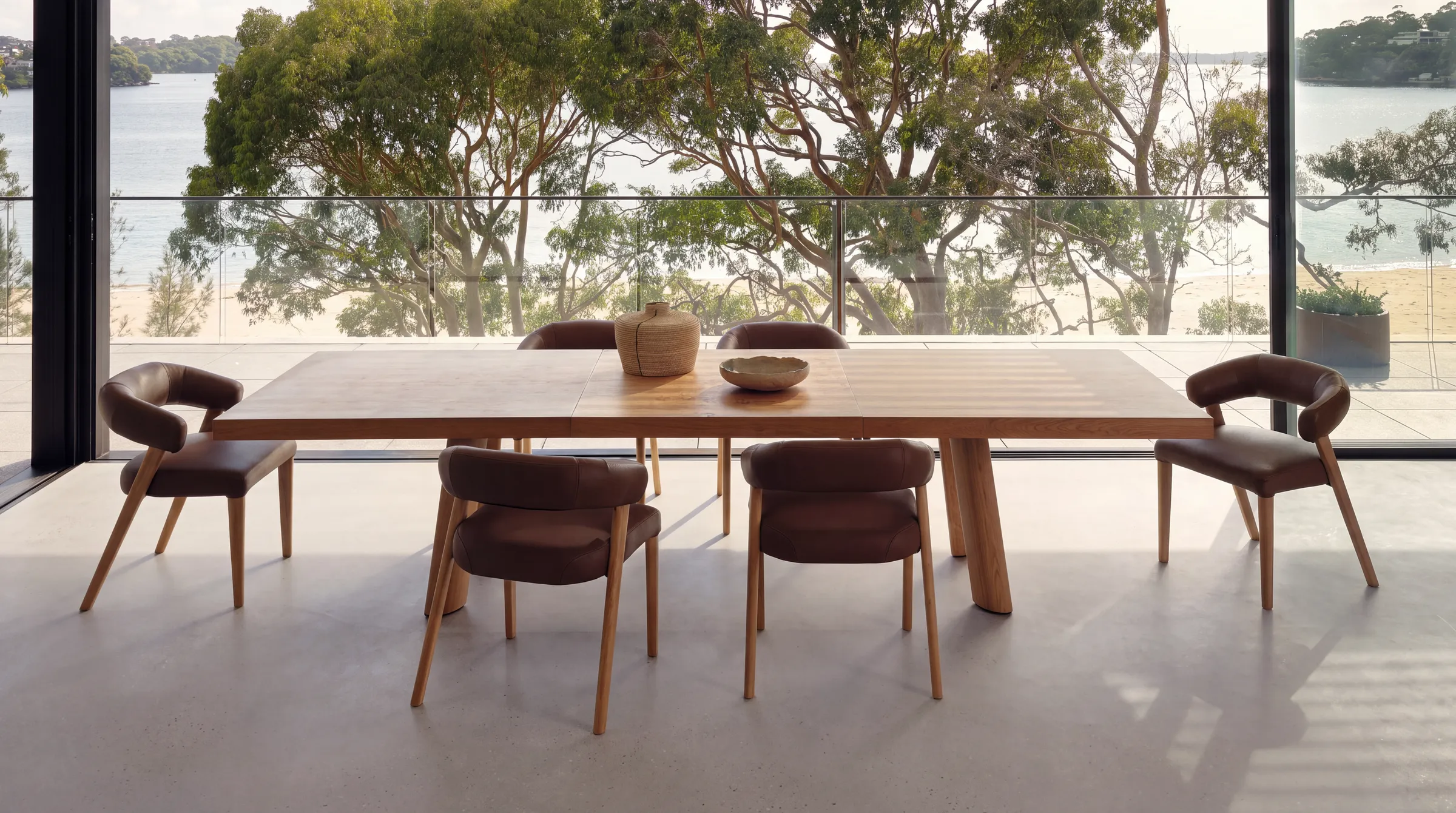
Two or three characteristic pieces are enough. One curved lounge chair, one pedestal table, one paper lamp, and the room reads as organic modernism. Add a fourth and it starts to look like a period set.
Keep the hero pieces and the materials authentic. Real wood, real stone, proper upholstery. Cheap materials in organic shapes are the fastest tell, because the shape says handmade and the surface says otherwise.
Everything around them can be current. Plaster or limewash walls, contemporary neutral upholstery, modern lighting elsewhere in the room. That contrast is what stops the anchor piece from reading as a museum object. Mixing eras deliberately, one sculptural piece against clean contemporary surrounds, is what makes it look like a home rather than a reconstruction.
What usually goes wrong
The whole room goes beige. This is imported from the current trend and it flattens everything. Organic modernism needs a visible grain, a stone or metal contrast, and at least one accent. Without them the curves have nothing to sit against.
The sculptural piece gets crowded. A curved form only reads if there is empty space around it. Push a Womb-style chair into a corner behind a side table and a plant, and you have bought a shape nobody can see.
Somebody buys the set. Matching chair, sofa, ottoman and table in one order gives you a showroom display. The style was always about collected pieces sitting together, not a suite.
Organic gets read as rustic. It is not distressed wood, shiplap or farmhouse anything. It is refined and sculptural. If the room looks reclaimed, you are in a different style entirely.
For hotels, cafes and offices
Organic modernism has hospitality in its DNA. Saarinen's Womb was the direct inspiration for Jacobsen's Egg, and both became lobby furniture. Saarinen's TWA Flight Center, now a hotel, is the landmark building of the whole approach.
At commercial scale, three things change. Sculptural seating has to be repeatable across quantities with matching finishes, not a one-off. Circulation matters more than in a home, and a pedestal base genuinely helps, because clearing legs means clearing knees and bags. And comfort is measured over hours, not minutes, so that low reclined seat works in a lounge and fails at a working table.
Frequently asked questions
Is organic modernism the same as mid-century modern?
Not quite. Organic design is a strand within the mid-century period rather than a separate era. They share materials and dates, but organic pushes hardest on curved, single-piece forms and cleared floors, while the broader mid-century look keeps visible tapered legs and straighter lines.
What did Frank Lloyd Wright mean by organic architecture?
He meant a building conceived as one integrated whole with its site, not a style of curves or a use of natural materials. He reworked the older rule that form follows function so that form and function became a single thing. It was a philosophy of coherence, not an aesthetic checklist.
Is organic modern the same as organic modernism?
They overlap but are not identical. The historical movement, roughly the 1930s to 1950s, was about sculptural form and new moulding technology. Today's organic modern is a decorating palette of earth tones, plaster and texture, closer in spirit to Japandi than to the historical movement. Many sources conflate the two, which is why beige rooms get called organic modernism. Those same decades produced Art Deco, which pulled the opposite way, toward geometry and symmetry.
Do I need real vintage pieces?
No. What has to be genuine is the material quality and the proportion, particularly the seat height. A well-made contemporary piece at the right dimensions reads correctly. A poorly made curve in thin material does not, whatever era it claims.
Get the proportions right in your own room
The style lives or dies on dimensions. A 40 cm seat instead of 47 cm, a base that clears the floor, a piece that fills the wall rather than leaving an awkward gap beside a balcony door. Those are decisions made at the drawing stage, not in a showroom.
Send us the measurements of your room, or photos of the wall you are working with, and tell us what you want built. We will make it to those dimensions. You are also welcome to come to the workshop in Tirana and sit in something before it exists.
Request a quote for your room and we will come back with dimensions, materials and a price.
To see what that looks like built, browse the pieces already out of the workshop in our gallery.